With chain of article of ADF skinning i.e. skinning of af:panelBox in Oracle ADF and !important CSS Declarations: How and when to use in ADF Skin. Today i will talk about skinning of panelTabbed
Requirement – To do skinning of panelTabbed in ADF.
Solution- For this, you have to understand this component .Header section contains three part
-> tab-start
-> tab-content
-> tab-end
try below code in your skin file and you can skin your panelTabbed . I am pasting below code for your skin file and explain what all this code is doing
/*it will be applied on header of tab*/
af|panelTabbed::header
{
  background-color:  transparent;
  border: none;

}

/*it will be applied on selected header of tab*/
af|panelTabbed::header:selected
{
  background-color:#233977 ;
  color: White;
   border: none ;
   border-color:transparent ;

}

af|panelTabbed::tab-start, af|panelTabbed::tab-end,  af|panelTabbed::tab:hover af|panelTabbed::tab-start, af|panelTabbed::tab:hover af|panelTabbed::tab-end  {
    background-image:none !important;
   background-color:#233977  !important;
   color:#233977  !important;
   border: none ;
   border-color:transparent;
}


af|panelTabbed::tab:selected af|panelTabbed::tab-content, af|panelTabbed::tab:selected:hover af|panelTabbed::tab-content {
  background-color:#233977 ;
  color:White;
  background: none;
   border: none ;
   border-color:transparent;

}
af|panelTabbed::tab:hover af|panelTabbed::tab-content {
     background-color: #C3E0F2; ;
     background: none ;

}

/*it will be applied on text in tab of panelTabbed */
af|panelTabbed::tab af|panelTabbed::tab-text-link {
    font-size:14px;
    font-weight:bold;
    color:#233977 ;
    line-height:16px;
}

/*it will be applied on text in selected tab of panelTabbed */
af|panelTabbed::tab:selected af|panelTabbed::tab-text-link {
    color:White;
    border: none;
    font-size:14px;
    font-weight:bold;
    line-height:16px;
}


af|panelTabbed::tab.p_AFSelected af|panelTabbed::tab-content, af|panelTabbed::tab.p_AFSelected:hover af|panelTabbed::tab-content
{
background-color: #233977 ; background-image:none;
color: White;
border: none;
}


af|panelTabbed::tab.p_AFSelected af|panelTabbed::tab-end, af|panelTabbed::tab.p_AFSelected:hover af|panelTabbed::tab-end
{
background-color: transparent;
 background-image:none;
}


af|panelTabbed::tab:selected af|panelTabbed::tab-content{
  border: none;
}
af|panelTabbed::body {
    background-color: #233977 ;
    color: White;
    border: thick ;
}
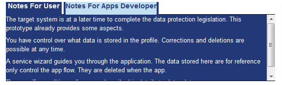
Final output is like below picture
happy learning with Vinay in Techartifact…